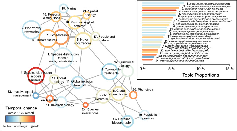
Fig. 3.
Structural topic model results from 4,035 studies that used GBIF-mediated data published from 2003 to 2019. Topic correlations network visualizes quantitative associations between topics (nodes), with topics near each other and connected by a gray line more likely to appear together in a given study. Node color denotes the relative change in prevalence over time within each topic, comparing topic prevalence in earlier studies (2003 to 2015) to those recently published (2016 to 2019). Node sizes are proportional to overall topic proportions. Network graphed using the Fruchterman–Reingold algorithm. (Inset) Bar chart of topic proportions across all years, indicating the percentage of the total corpus that belongs to each topic, with topic numbers corresponding to topic names in network graph and bar color corresponding to temporal change. The top six words by probability associated with each topic are given in italics (SI Appendix, Table S1).

