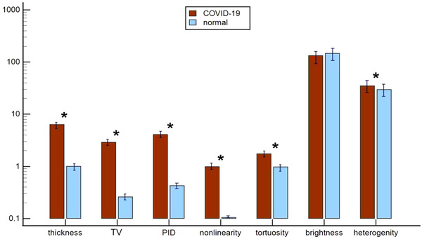
FIGURE 2.

A comparison of computer‐based pleural line (p‐line) features of COVID‐19 and normal cases. Bars represent mean ± SE of each feature. Red bars represent COVID‐19 cases. Light blue bars represent normal cases. * indicates statistically significant difference (P < 0.05). Notably, 6 of 7 p‐line features showed statistically significant difference between the 2 groups. COVID‐19, coronavirus disease 2019; PID, projected intensity deviation; TV, thickness variation
