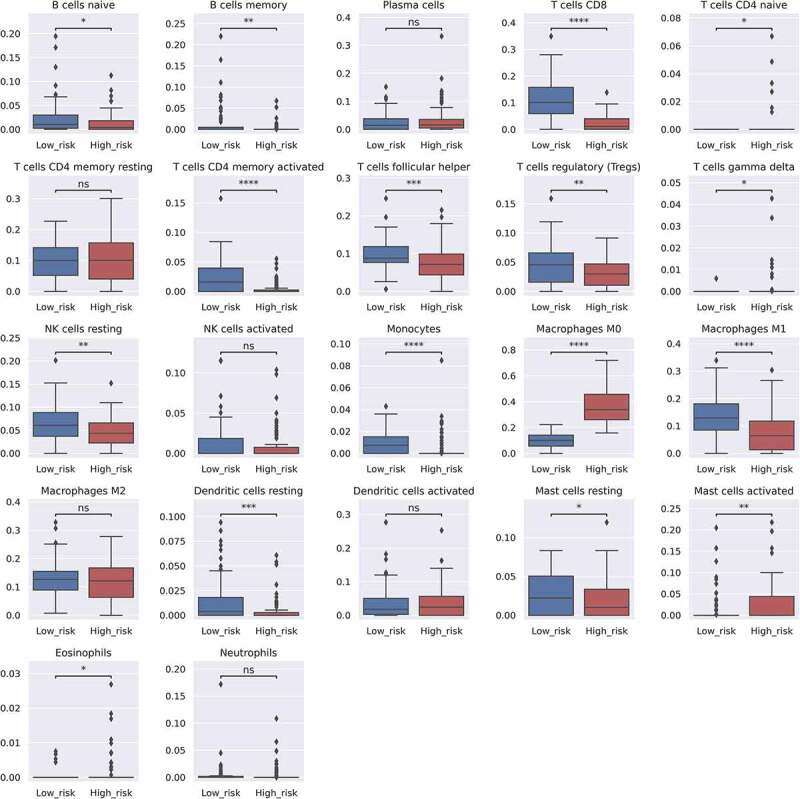
Figure 3.

Bar plots indicating the differences in the estimated LM22 fraction between the high and low survival risk groups. Each p-value is written above the bar plots (NS: p > .05, *: p ≤ 0.05, **: p ≤ 0.01, ***: p ≤ 0.001, and ****: p ≤ 0.0001). Y-axis indicates predicted fraction level of each cell subtype
