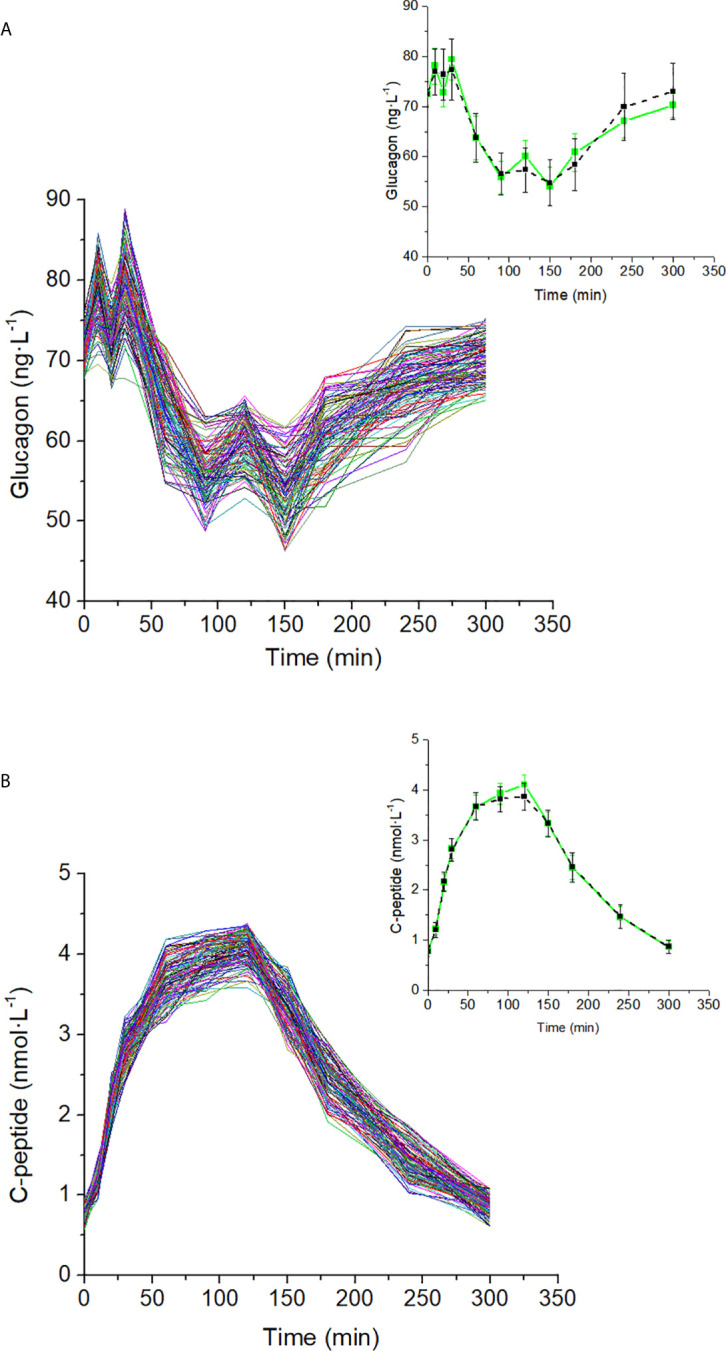
Figure 4.

Glucagon (A) and C-peptide (B) curves in the 100 virtual subjects (spaghetti plot). In the related inset plots, green continuous lines represent the mean (± SD) over the 100 curves; black dashed lines represent mean (± SD) taken from Pepino et al. (31), from which the virtual subjects were derived.
