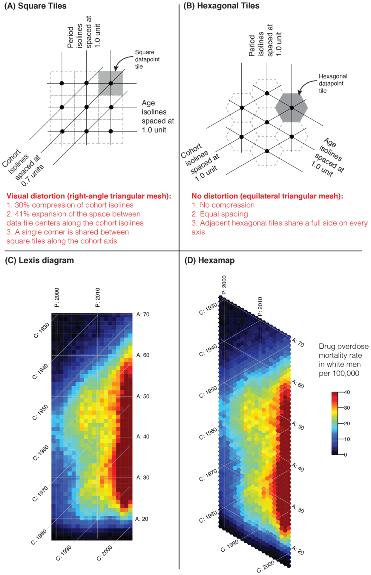
Figure 1.

Correcting the visual distortion in Lexis diagrams by using hexamaps. (A) illustrates the distortion of cohort isolines using square tiles in a Lexis diagram; (B) corrects for this visual distortion using hexagonal tiles. (C) and (D) compare the patterns of accidental drug overdose deaths among white men in a traditional Lexis diagram versus a hexamap, respectively. [A = Age ranging from 15 through 70 years, P = Period ranging from 1999 through 2018, C = Cohort ranging from 1929 through 2003].
