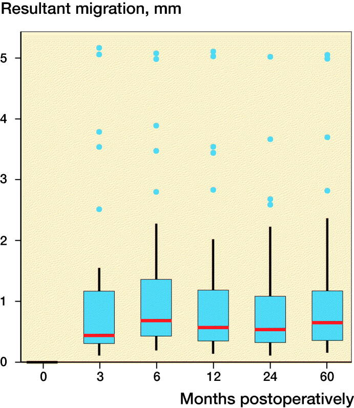
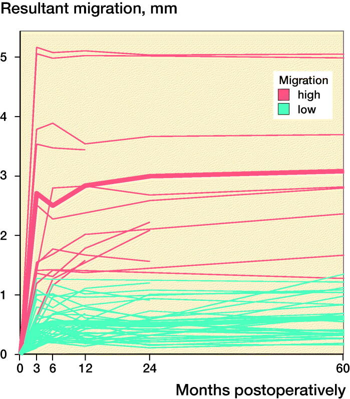
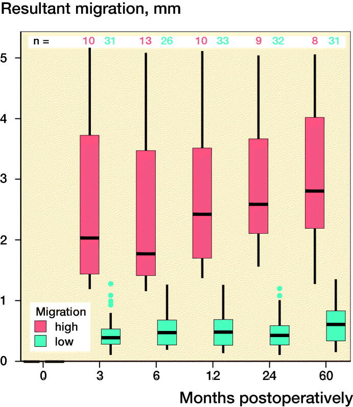
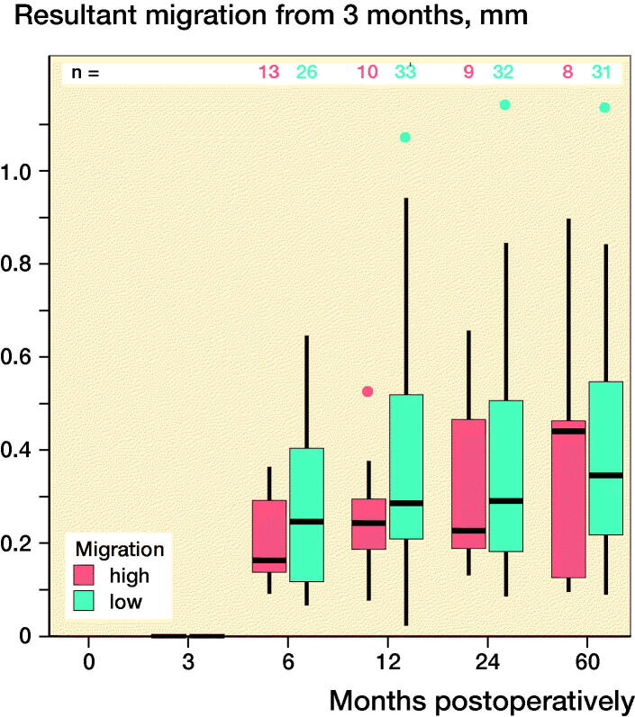
Figure 2.
Box-plots showing resultant implant migration (A) in all patients during follow-up, (B) during follow-up, categorized according to the initial migration percentile, (C) in all patients in relation to the first postoperative follow-up, and (D) in relation to the 3-month follow-up. ν represents the ≥ 75% group, and ν represents the < 75% group.


