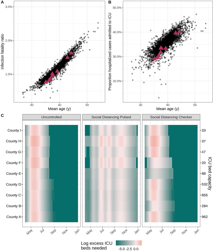
Figure 3.
Health outcome risks and logistical needs for fictional counties. In the scatterplots, each point indicates (A) the age-adjusted infection fatality ratio and (B) risk of ICU admission given hospitalization by mean age for a county within the United States. Data for the nine fictional counties in our vignette is marked by magenta triangles. (C) The heat maps display county-level ICU bed needs, shaded according to the log ratio above or below the assumed ICU bed capacity (secondary y-axis) in each county (primary y-axis) for three example intervention scenarios (panels). The salmon pink shading indicates periods of time where ICU bed needs exceed capacity in the fictional counties.

