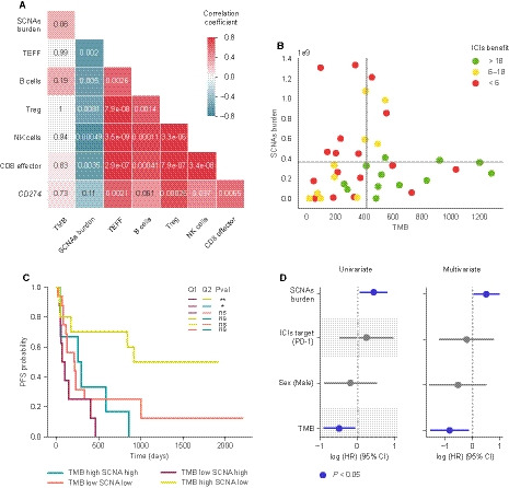
Fig. 3.

Interplay between biomarkers of response to ICIs. (A) Spearman correlation between indicated features. Color represents the correlation coefficient. The P value of each correlation is shown within each cell. (B) Scatter plot representation of TMB and SCNAs burden. Horizontal and vertical gray lines represent the SCNAs burden and TMB mean, respectively. Dot color represents the group of benefit. (C) Kaplan–Meier plot survival curves dividing the cohort into four groups based on the quadrants defined in panel 3B. Long‐rank tests have been used to determine differences between TMB‐SCNAs groups. ns: 0.05 < P ≤ 1.0; *: 0.01 < P <0.05; **: 0.001 < P ≤ 0.01. (D) Univariate and multivariate Cox proportional hazards model for SCNAs burden, ICIs target, sex, and TMB. Multivariate analysis has been stratified by histology and smoking history. Features represented in blue are statistically significant (P < 0.05).
