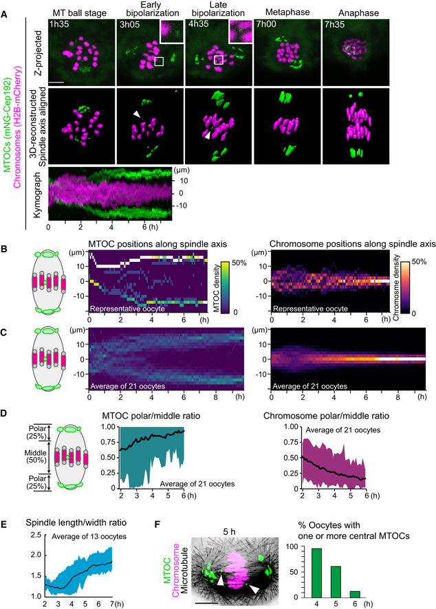
Figure 1. Establishment of 4D quantitative analysis for MTOC dynamics.

- Live imaging of MTOC dynamics during meiosis I. Z‐projection images (top) show MTOCs (mNG‐Cep192, green) and chromosomes (H2B‐mCherry, magenta). Central MTOCs are magnified (squares). 3D‐reconstructed spindles are aligned with the spindle axis (middle). Central MTOCs are indicated with arrowheads. Time in h:mm. The kymograph (bottom) shows projected signals on the spindle axis for all time points.
- Density maps of MTOCs (left) and chromosomes (right) along the spindle axis in a representative oocyte. The color represents the percentage of MTOCs or chromosome volumes, respectively, coded from dark (0%) to white (50% or more of the total volume).
- Average density maps of 21 oocytes mapped as in (B). Data from six independent experiments are used.
- Dynamics of MTOC sorting and chromosome congression. Ratio of MTOCs (left) or chromosomes (right) in the polar region versus those in the middle region of the spindle are plotted over time.
- Dynamics of spindle elongation. The spindle was visualized with EGFP‐Map4 (Fig EV1). The length/width ratio of the spindle was measured after 3D reconstruction (n = 13 oocytes from three independent experiments).
- Percentage of oocytes carrying one or more MTOCs in the middle region of the spindle. Oocytes were fixed and stained for MTOCs (pericentrin, green), chromosomes (Hoechst33342, magenta), and microtubules (α‐tubulin, gray). n = 21, 28, 24 oocytes. A representative oocyte fixed at 5 h after NEBD is shown. Arrowheads indicate central MTOCs.
Data information: Time after NEBD. Mean ± SD are shown. Scale bars, 10 μm. See also Movie EV1.
Source data are available online for this figure.
