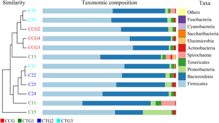
FIGURE 5.

UPGMA (Unweighted pair‐group method with arithmetic mean) map. Note: The sample hierarchical clustering tree is shown as follows: sample clustering tree ‐‐the closer the samples are, the shorter the branches are, indicating that the species composition of the two samples is more similar. Abundance bar chart ‐‐ compares the species diversity, abundance similarity and dominant species of each sample according to the proportion of each color block. CCG, CTG1, CTG2 and CTG represent control group, treatment group 1, treatment group 2 and treatment group 3, respectively
