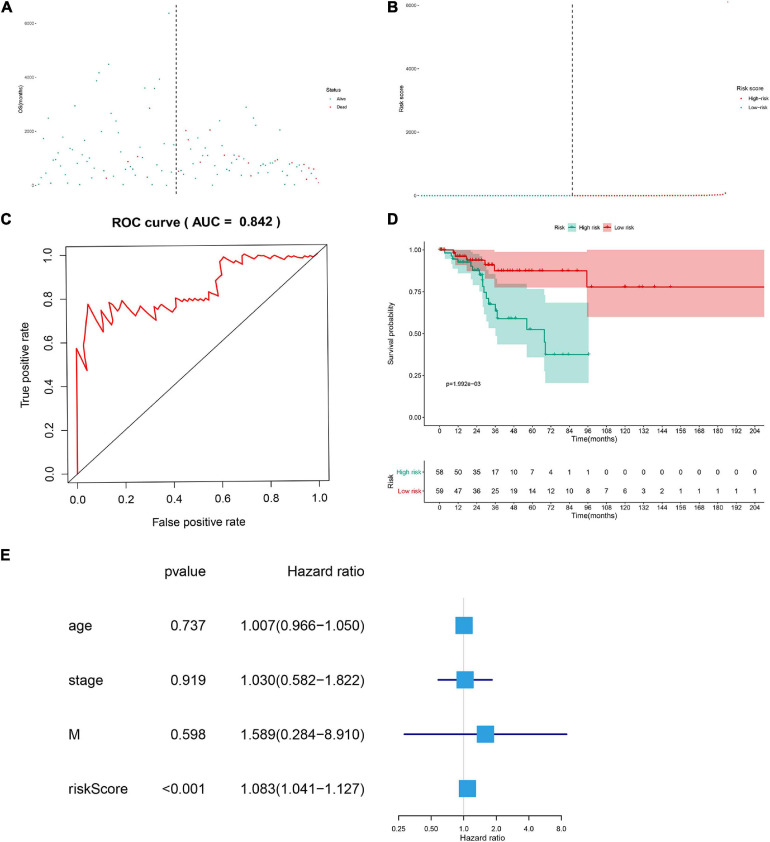
FIGURE 5.
The scatter plot of the samples (A), the risk curve of each sample reordered by risk score (B), green and red represent low risk and high risk groups, respectively. ROC curve (AUC = 0.921) for prognostic DESRGs (C). Overall survival Kaplan–Meier curve for prognostic DEMRGs (p < 0.001) (D). Univariate Cox regression models indicated the risk score was an independent prognostic factor (E).

