-
A
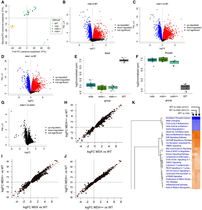
Principal component analysis of the MoMus RNA‐seq counts.
-
B
Volcano plot for the F test on differential expression between WT and mdx mice.
-
C
Volcano plot for the F test on differential expression between WT and mdx++ mice.
-
D
Volcano plot for the F test on differential expression between WT and mdx+− mice.
-
E, F
Boxplot comparing the distribution of the Dmd and Prune2 genes in the WT, mdx, mdx++, and mdx+− mice groups. The central band of the boxplot denotes the median; the box denotes the first and third quartile; the whiskers are computed as min(max(x), Q3 + 1.5 * IQR) and max(min(x), Q1 – 1.5 * IQR), where min(x) and max(x) denote the minimum and maximum of the distribution, Q1 and Q3 the first and third quartile, and IQR the interquartile range.
-
G
Volcano plot for the F tests on differential expression between mdx++ and mdx+− mice.
-
H–J
Scatter plots comparing the estimated logFCs across mice groups. Panel H: mdx vs. mdx++. Panel I: mdx vs mdx+−. Panel J: mdx++ vs. mdx+−.
-
K
Heatmap obtained by Ingenuity Pathway Analysis showing the most affected pathways across mdx, mdx++, and mdx+− mice.

