-
A
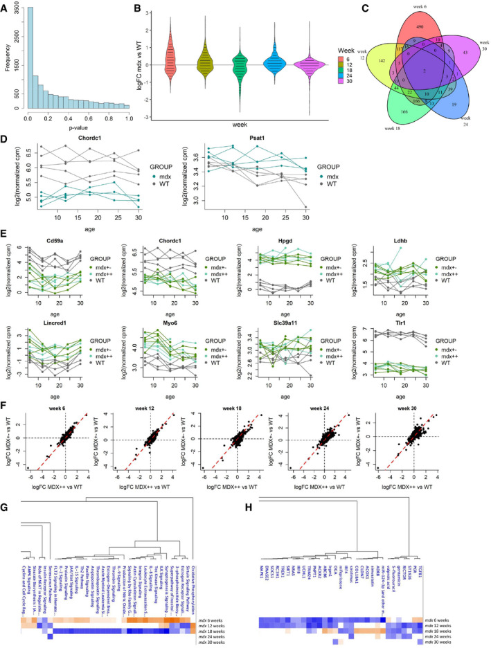
Histogram of the likelihood ratio p‐values for the test on differences between WT and mdx at any time point.
-
B
Distribution of the estimated logFCs for mdx versus WT mice at weeks 6, 12, 18, 24, and 30 for the 1,532 genes with significant differences between WT and mdx.
-
C
Venn diagram showing the overlap between the sets of genes with significant differences between WT and mdx mice at different weeks.
-
D
Trajectory plots comparing the trajectories of Chordc1 and Psat1 in WT and mdx mice.
-
E
Trajectory plots comparing the trajectories of Cd59a, Chordc1, Hpgd, Ldhb, Lincred1, Myo6, Slc39a11, and Tlr1 in WT, mdx++, and mdx+− mice.
-
F
Scatter plots comparing the estimated logFC of mdx++ vs WT (x‐axis) and of mdx+− vs. WT (y‐axis) at weeks 6, 12, 18, 24, and 30.
-
G, H
Pathway analysis (G) and upstream regulator analysis (H) performed by Ingenuity Pathway Analysis of the comparison between mdx and wt mice.

