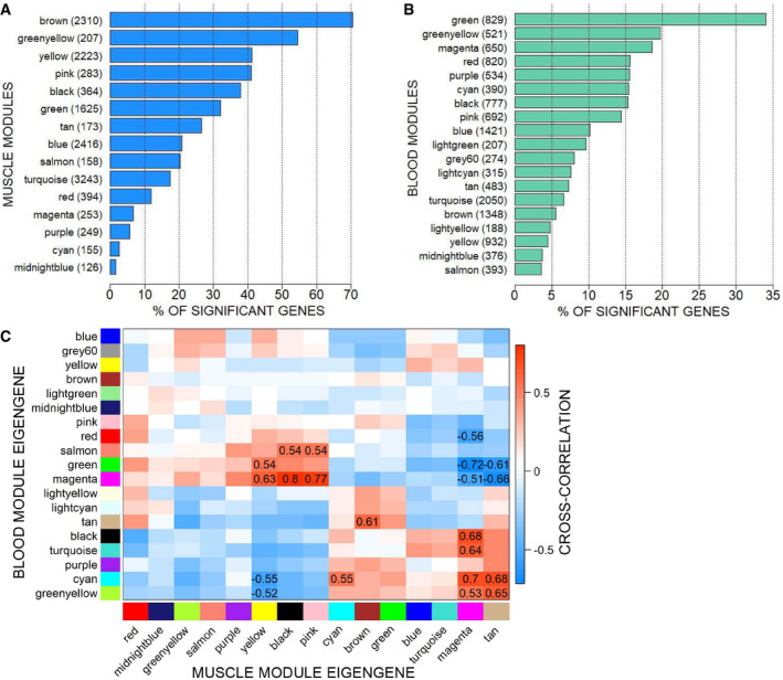
Figure 4. Integration of the MoMus and MoLong datasets.

- Barplot showing the percentage of significant genes in the muscle modules. Next to each module name, we report the total number of genes that it comprises.
- Barplot showing the percentage of significant genes in the blood modules. Next to each module name, we report the total number of genes that it comprises.
- Matrix with the values of the cross‐correlation between blood and muscle module eigengenes. To enhance visibility, only correlations with absolute value above 0.5 are shown.
