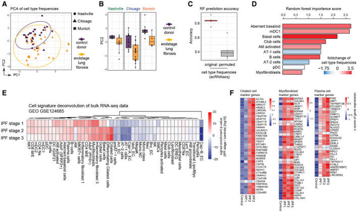
Figure 3. Disease progression alters cell type frequencies.

- Principal components one (x‐axis) and two (y‐axis) illustrate the cell type frequencies in reduced dimensions. The shape of each point corresponds to the study cohort, and the points are colored by disease phenotype.
- Box plots display principal component two across ILD patients (orange) and control samples (purple) for the three study cohorts. The boxes represent the interquartile range, the horizontal line in the box is the median, and the whiskers represent 1.5 times the interquartile range (Chicago cohort: ILD n = 9, controls n = 8; Nashville cohort: ILD n = 20, controls n = 10; Munich cohort: ILD n = 3, controls n = 11).
- Box plot depicts random forest model prediction accuracies derived from fivefold cross‐validation using the original and permuted labels. The boxes represent the interquartile range, the horizontal line in the box is the median, and the whiskers represent 1.5 times the interquartile range (n = 5).
- Barplot shows the random forest importance scores for the top ten most informative features.
- The heatmap shows changes of the indicated cell type signatures in published bulk RNA‐seq data (GEO GSE124685) across different histopathological stages that represent increasing extent of fibrosis from stage 1–3, as determined by quantitative micro‐CT imaging and tissue histology (McDonough et al, 2019). Samples used in this study were 10 IPF and 6 control patients.
- The heatmaps show z‐scores for the individual marker genes of the indicated cell types across IPF stages and controls.
