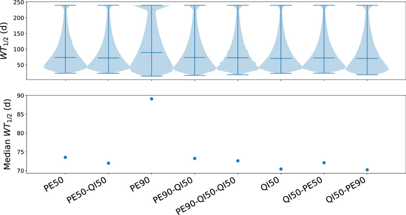
Fig. 8.
Simulations of treatment corresponding to the rotation protocols. The top panel is a violin plot showing the probability densities of WT values from the simulations (Y-axis: WT, X-axis: probability densities for each protocol). The horizontal lines show minimum, median and maximum values. The bottom panel shows the median WT. Higher WT values implicate that the tumour is sensitive to the treatment for a longer time. The figure was obtained by simulations of the mutational landscape using the wollsey stochastic evolution simulator [6]

