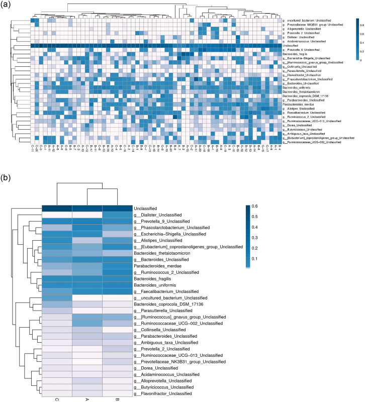
Fig 3. The heatmap analysis of the top 30 species.
a: Cluster of samples. b: Cluster of groups. The columns represent samples and/or groups and the rows represent species. The dendrogram above the heatmap is the cluster result of the samples and/or groups and the dendrogram to the left is the species cluster. The colours in the heat map represent the relative abundance of the corresponding species in the corresponding sample or group.

