. 2021 Apr 9;10:e63632. doi: 10.7554/eLife.63632

Figure 2. Improvements to 2D projection and label transfer for scATAC-seq data.

(a) Uniform manifold approximation and projection (UMAP) projection plots for corresponding datasets in Figure 1. Points are colored based on a common scale of fraction of reads in peaks, bottom right. The number of cells in each panel is displayed in Figure 1b. (b) UMAP projection plots colored based on cell type obtained by label transfer from scRNA-seq (Materials and methods). Colors for cell types are below, to the right. (c) To visualize the number and quality of transferred labels, we ranked all cells based on the Seurat label transfer score obtained from label transfer results and plotted lines through the score (y-axis) vs. rank (x-axis) values. (d) Barplot showing the fraction of cells in each dataset that were assigned each cell-type label. The top row shows cell-type proportions for the same peripheral blood mononuclear cell sample obtained by 25-color immunotyping flow cytometry (Materials and methods, Supplementary file 3, and Figure 2—figure supplement 1). Root-mean-square deviation values were computed by comparison of labeled cell-type proportions to values derived from flow cytometry (Supplementary file 4). Colors for cell types are to the right of the barplot.

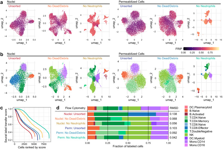
Figure 2—source data 1. Single cell UMAP coordinates and labeling scores.
Figure 2—source data 2. Fractions of cells assigned to each type by flow cytometry and scATAC-seq.

Figure 2.

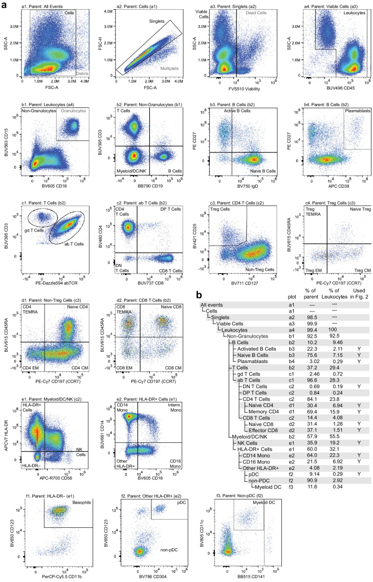
Figure 2—figure supplement 1. Flow cytometry gating used to classify and quantify cell-type abundance.

Figure 2—figure supplement 1.

Cells were stained with a panel of 25 fluorescently labeled antibodies in total, fluorescence was measured using a Cytek Aurora spectral flow cytometer, and events were manually gated to assess cell-type abundance. (a) Pairwise feature plots show the gates used for cell-type assessment. Plots are arranged in rows (labeled a–f) and columns (labeled 1–4). The plot and label of the parent gate are at the top of each plot, and gates derived from each set of markers are labeled within the plots. (b) Gating hierarchy used to quantify cell types, with references to the plot in which each gate is defined. Cell-type labels used to generate reference proportions in Figure 2 are specified in the last column.
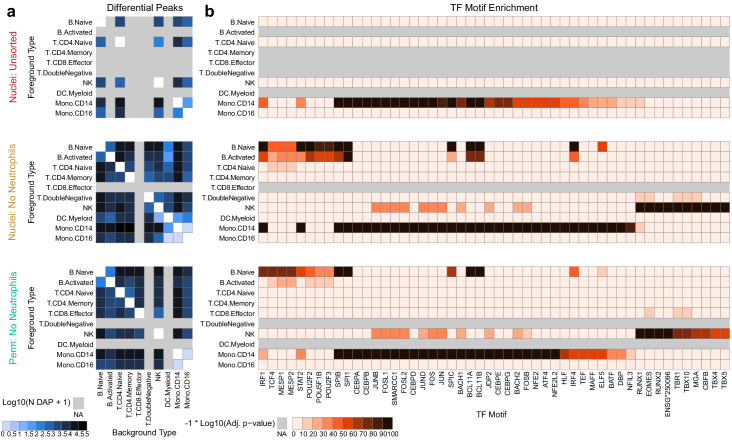
Figure 2—figure supplement 2. Improved diffential peak and motif detection.

Figure 2—figure supplement 2.

(a) Heatmap plots of pairwise differentially accessible peaks (DAPs) between each pair of types as computed with Wilcoxon tests using the ArchR package (Granja et al., 2020) (Materials and methods). Values shown are the number of peaks more highly accessible in the foreground type (y-axis) compared to the background type (x-axis). Colors represent log10-scaled and binned counts of DAPs, as shown in the scale to the bottom-left. Gray regions represent cell types that were not observed in a dataset. (b) Heatmap plots of enriched transcription factor binding site motifs. Colors represent −1 × log10-scaled and binned adjusted p-values for tests of enrichment (Materials and methods). Values > 100 are colored black.