. 2021 Apr 9;10:e63632. doi: 10.7554/eLife.63632

Figure 4. Trimodal measurement of transcription, epitopes, and accessibility.

(a) Workflow diagram for the major steps in transcription, epitopes, and accessibility (TEA-seq). (b) Scatterplot comparing unique single-cell assays for transposase-accessible chromatin (scATAC-seq) fragments and scRNA-seq unique molecule indexes (UMIs) for each TEA-seq cell barcode. In (a, b, d, and e), n = 227,390 barcodes are displayed in total; 29,264 passing QC criteria are represented by purple points. (c) Scatterplot comparing unique scATAC-seq fragments and antibody-derived tags UMIs for each cell barcode. (d) scATAC-seq QC scatterplot comparing unique scATAC-seq fragments and fraction of reads in peaks scores for each cell barcode. n = 34,757 total cells are displayed (those with >1,000 unique ATAC fragments); 29,264 passing QC criteria are represented by purple points. (e) Uniform manifold approximation and projection (UMAP) projections generated using each of the three modalities separately. Only cells passing QC (n = 7,939 barcodes) are presented in (ef). (f) A joint UMAP projection generated using three-way weighted nearest neighbors that leverages all three of the measured modalities. (g) Scatterplot showing the peak-to-RNA correlations (x-axis) and peak-to-protein (y-axis) correlation values for each peak (points) that was found to be correlated with the CCR2 gene or CD192 antibody in TEA-seq data. Histograms at the margins show the distribution of scores for RNA correlations (top) and protein correlations (right). Dashed line shows 1:1 correspondence. Peaks not found to be correlated in each method were assigned a score of 0. (h) Genome tracks showing links between peaks (red hashes) and the CCR2 gene based on protein expression (above peaks) and gene expression (below peaks). Correlations are represented by arcs colored based on the correlation score (color scale for both panels to the left). The bottom panel shows the gene neighborhood around CCR2. All coordinates are from the Hg38 genome assembly. (i), as in (g), for the CD38 gene and correlated peaks. (j), as in (h), for the CD38 gene locus.

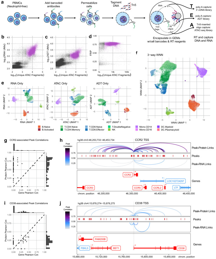
Figure 4—source data 1. Single cell quality metrics for TEA-seq samples.
Figure 4—source data 2. Cell type labels and UMAP coordinates for TEA-seq samples.
Figure 4—source data 3. Peak to gene and peak to protein link correlations.

Figure 4.

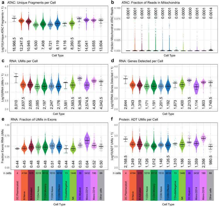
Figure 4—figure supplement 1. Quasirandom-jittered plots (jittered only on x-axis) showing various QC metrics from transcription, epitopes, and accessibility (TEA-seq) cells that passed all QC criteria (Materials and methods).

Figure 4—figure supplement 1.

In each panel, cells are separated by cell type based on cell-type labels assigned by RNA-seq label transfer (x-axis). Median values per cell type for each metric are printed within the plot region at the x-axis position corresponding to each cell type. Types and number of cells in each category are displayed below the bottom row and apply to all plots in each column. (a) Number of unique assays for transposase-accessible chromatin (ATAC) fragments detected per cell (y-axis, log10 scale). (b) Fraction of raw ATAC fragments that were aligned to mitochondrial regions (y-axis, linear scale, max = 0.1). (c) Number of RNA unique molecule indexes (UMIs) assigned to each cell (y-axis, log10 scale). (d) Number of genes detected by RNA-seq for each cell (y-axis, log10 scale). (e) Fraction of RNA UMIs from exonic regions (y-axis, linear scale). (f) Number of antibody-derived tags UMIs assigned to each cell (y-axis, log10 scale).
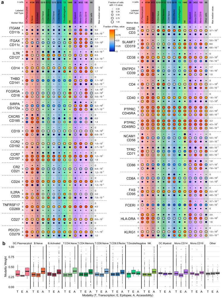
Figure 4—figure supplement 2. Cell-type marker expression and modality weights.

Figure 4—figure supplement 2.

In each panel, cells are grouped by cell-type labels assigned by RNA-seq label transfer. (a) Detection of 36 protein markers with corresponding single-cell assays for transposase-accessible chromatin (scATAC-seq) GeneScores and RNA unique molecule indexes (UMIs) from transcription, epitopes, and accessibility (TEA-seq) cells. Markers included in the antibody-derived tags set (Supplementary file 6) were filtered to retain only those with both corresponding GeneScores and RNA UMI counts. Each horizontal section of the plot, separated by dashed lines, presents detection for a single marker. When gene symbols differ from the protein marker name, the gene name is shown above the antibody name. Each section is subdivided into rows for each of the three assays (T, transcription; E, epitope detection; A, chromatin accessibility). The size of each point represents the fraction of cells within each cell type (columns) with > 0 detection for each marker within each modality (larger points = greater fraction). The color of each point represents the median of the detected value for each assay, normalized within each row between zero (dark blue) and the maximum value for each feature and modality (provided at the right of each row). Color and size legends between the left and right panels apply to all points. For the comparison to PTPRC/CD45RA and PTPRC/CD45RO, the transcription (T) and accessibility (A) values are repeated. Mod, modality. (b) Weight contributions of each modality to the weighted nearest neighbors graph used to generate the uniform manifold approximation and projection . Boxplots represent the modality weight distribution of individual cells within each cell type; heavy lines mark the median value, box boundaries represent the 25th and 75th quantiles, and whiskers extend to 1.5 times the interquartile range above the box boundaries.
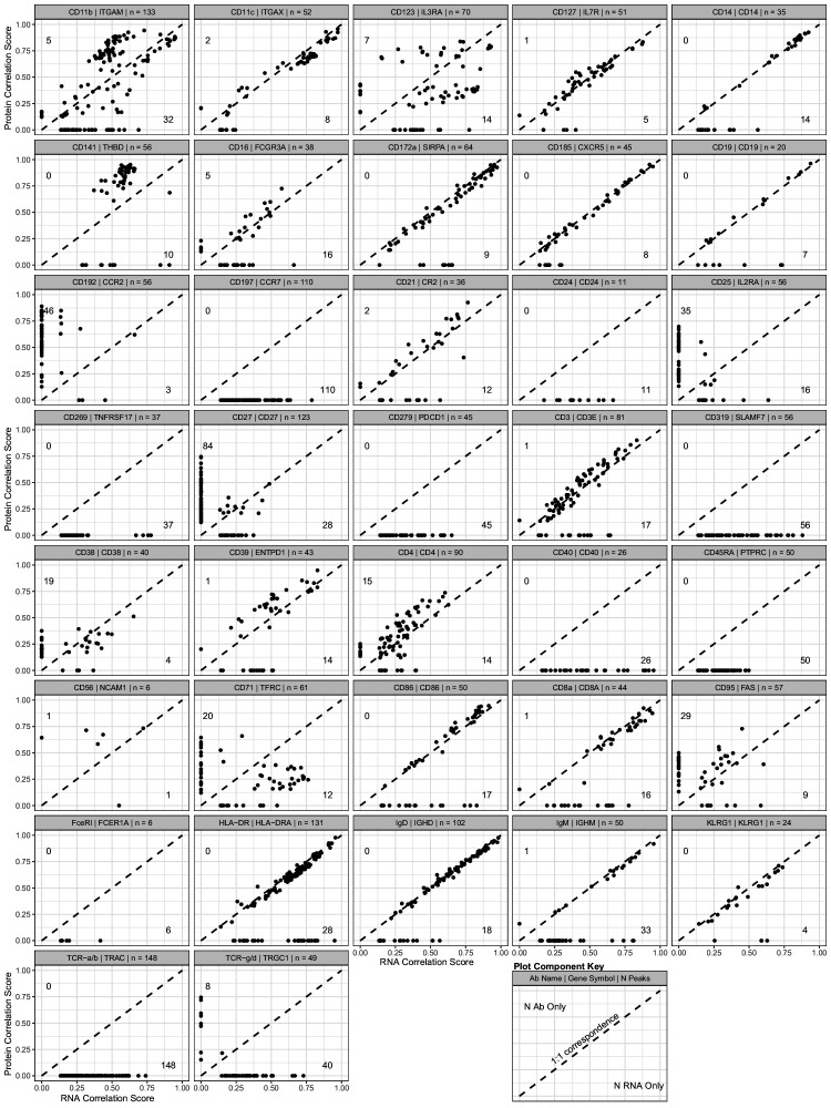
Figure 4—figure supplement 3. Scatterplot showing the peak-to-RNA correlations (x-axis) and peak-to-protein (y-axis) correlation values for each peak (points) that was found to be correlated with the genes in our antibody-derived tags antibody panel used for transcription, epitopes, and accessibility (TEA-seq) experiments.

Figure 4—figure supplement 3.

The header of each plot shows the antibody and gene names used to profile each target, as well as the total number of peaks found to be linked to either RNA or protein expression. Dashed line shows 1:1 correspondence. Peaks not found to be correlated in each method were assigned a score of 0. The number of peaks found only by protein correlation or RNA correlation is shown near the end of their respective axes (top-left for protein; bottom-right for RNA). See the plot component key at the bottom-right of the figure for a visual guide.
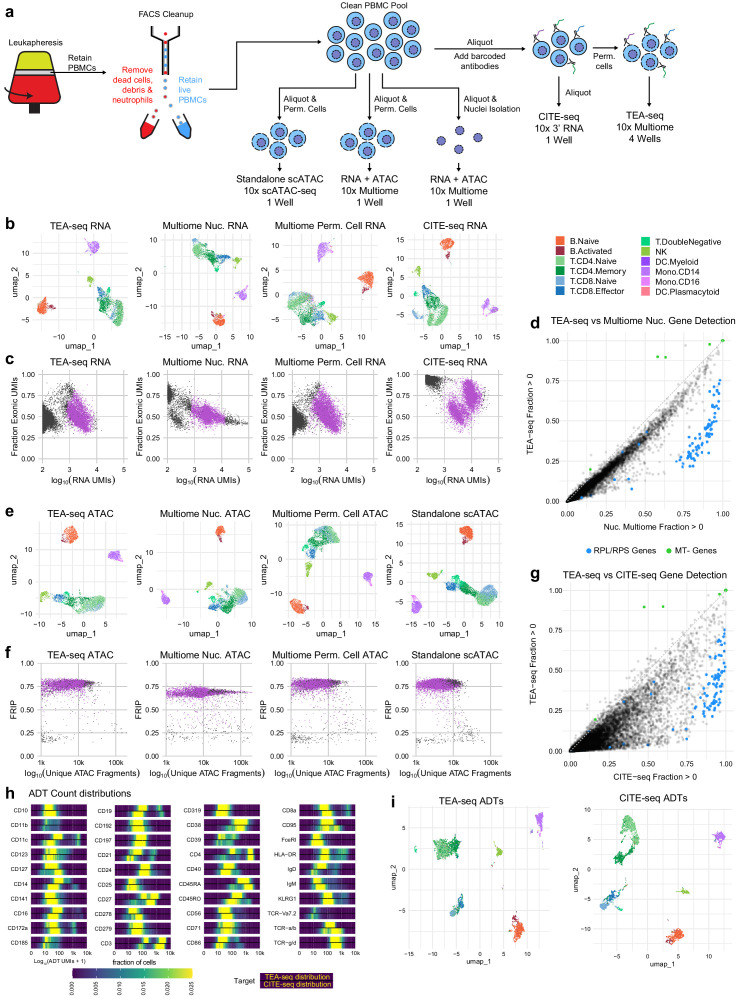
Figure 4—figure supplement 4. Direct comparisons of TEA-seq, scATAC-seq, CITE-seq, and 10x Multiome.

Figure 4—figure supplement 4.

(a) Experimental workflow diagram for the comparative experiments demonstrating shared cell sources and aliquot branching to highlight the relationships between the datasets. (b) Qualitative assessment of scRNA-seq data from transcription, epitopes, and accessibility (TEA-seq), non-stained 10x Multiomics datasets, and a cellular indexing of transcriptomes and epitopes (CITE-seq) dataset generated using the 10x 3′ RNA-seq kit using whole cells by uniform manifold approximation and projection (UMAP) projection visualization. Each point represents a single cell; points are colored based on cell-type labels generated by RNA-seq label transfer. (c) Comparison of the number of scRNA-seq unique molecule indexes to the fraction of scRNA-seq reads derived from exons for each experiment in (b). Barcodes passing QC are highlighted in purple. (d) Pairwise comparison of gene detection frequencies in purified nuclei used for 10x Multiome analysis (x-axis) and TEA-seq (y-axis). Each point represents a single gene. Blue points highlight ribosomal protein genes (RPL/S); green points highlight mitochondrial genes (MT-). Black points are all other genes. (e) Qualitative assessment of scATAC-seq data from TEA-seq, non-stained 10x Multiomics datasets, and standalone 10x Genomics scATAC-seq by UMAP projection visualization. Each point represents a single cell; points are colored based on cell-type labels generated by ATAC-seq GeneScore label transfer compared to a RNA-seq reference. (f) scATAC-seq QC scatterplot comparing unique scATAC-seq fragments and fraction of reads in peaks scores per cell barcode for each experiment in (e). Barcodes passing QC are highlighted in purple. (g) Pairwise comparison of gene detection frequencies in purified nuclei used for CITE-seq (x-axis) and TEA-seq (y-axis), as in (d). (h) Heatmaps of log10-transformed antibody-derived tags (ADT) count distributions. In the panel for each target, we show the fraction of cells falling into each of 400 bins between 1 and 10,000 (0 and 4 on a log scale). The color scale at the bottom of the plots is used for all targets. Within each target panel, the top distribution is that obtained from TEA-seq, and the bottom from CITE-seq based on equally downsampled datasets, as described in Materials and methods. (i) Qualitative assessment of ADT data from TEA-seq and CITE-seq by UMAP projection visualization. Each point represents a single cell; points are colored based on cell-type labels generated by RNA-seq label transfer.