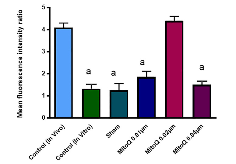
Figure 3.

green ratio. Each column in these graphs indicates the significant difference between control, sham and treated groups (Mean ± SEM). a, versus in vivo-control and 0.02 µM MitoQ (p <0. 01)

green ratio. Each column in these graphs indicates the significant difference between control, sham and treated groups (Mean ± SEM). a, versus in vivo-control and 0.02 µM MitoQ (p <0. 01)