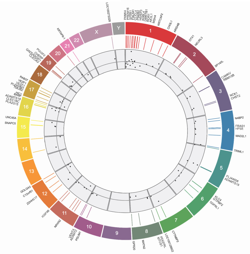
Figure 3:
Circular map of genomic distribution among differentially methylated CpGs. From the outmost ring inward, the map shows gene names, chromosome number, position within the chromosome, and effect sizes among Average Causal Effects (below the gray line is a negative effect size and above the line is a positive effect size).

