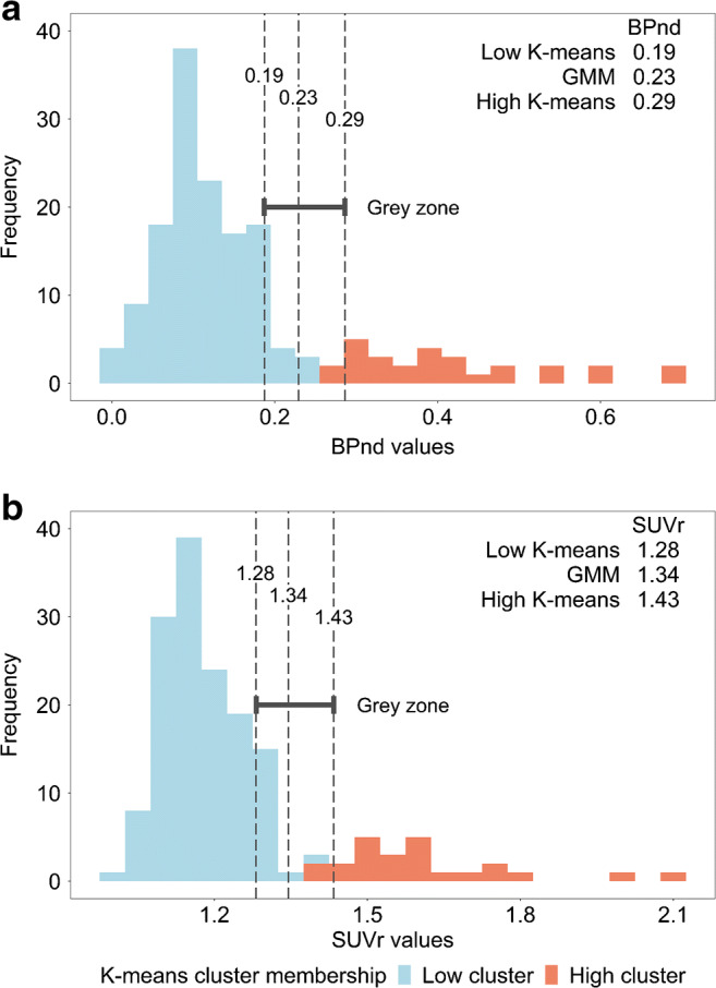
Fig. 1.

Visualization of thresholds and grey zone. Two frequency histograms containing all mean BPND values (a) and SUVr values (b), with K-means cluster membership visualized by different colours (blue and red). The dashed lines represent the 6 different thresholds (for BPND: 0.19, 0.23 and 0.29, for SUVr: 1.28, 1.34 and 1.43). The grey zone was operationalized as the range between the lowest and the highest thresholds derived through K-means clustering. For BPND, 121 participants had an amyloid burden lower than the low K-means threshold, 15 participants had grey zone amyloid burden and 26 participants had an amyloid burden higher than the high K-means threshold. For SUVr, the numbers were 125, 15 and 22 respectively
