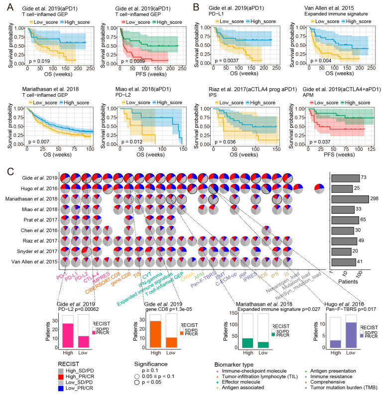
Figure 6.
The impact of ICB response biomarkers on clinical efficacy of ICB therapy. Kaplan–Meier survival curves showing OS or PFS for patients with high versus low scores of (A) T cell-inflamed GEP in melanoma, T cell−inflamed GEP in UC and PD−L2 in ccRCC. Kaplan-Meier survival curves showing OS for patients with high versus low scores of (B) PD−L1 under anti-PD-1 therapy, Expanded immune signature under anti-CTLA-4 therapy and IPS under “anti-CTLA-4 prog anti-PD-1” therapy. Kaplan–Meier survival curves showing PFS for patients with high versus low scores of APM under the combination anti-PD-1 and anti-CTLA-4 therapy. (C) Top: the pies on the left panel showing the significance of association for each response biomarker in each overall benchmark dataset and the barplots on the right panel showing the numbers of patients in each dataset. The left half of the pie chart represented the patients with high scores of the corresponding biomarkers, red and dark gray indicated the proportion of responders and non-responders in high-score patients, respectively. The right half of the pie chart represented the patients with low scores of the corresponding biomarkers, blue and light gray indicated the proportion of responders and non-responders in patients with low-score patients, respectively. Borders with no color, gray borders and black borders represented p ≥ 0.1, 0.05 ≤ p < 0.1, p < 0.05, respectively. Different categories of biomarkers were represented by different colors. Bottom: objective response in patients with high versus low scores of PD-L2 and gene.CD8 in the Gide et al., 2019 dataset, Expanded immune signature in the Mariathasan et al., 2018 dataset and Pan−F−TBRS in the Hugo et al., 2016 dataset. Proportion of PR/CR were colored on histograms based on the categories of corresponding biomarkers, with the numbers of patients shown in each bar. Datasets with less than 20 samples were excluded from the analysis.

