Figure 3.
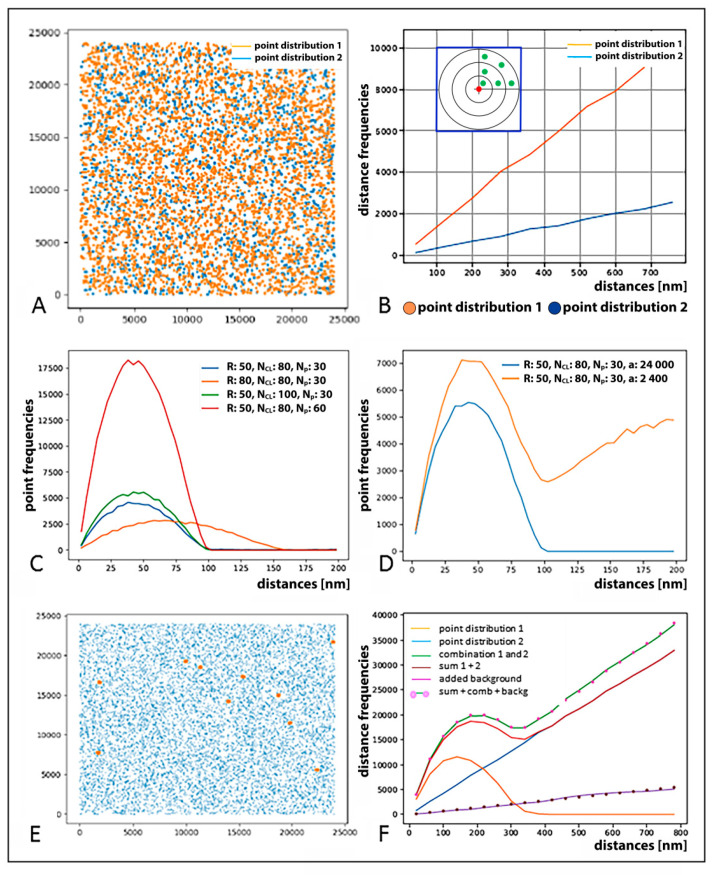
(A) Computer simulation of artificial point patterns and related Ripley evaluation curves used to demonstrate how structures and their descriptions can be extracted from distance frequency histogram curves. (A) Example of a point pattern of two homogenous (random) point distributions (blue 2 × 10³ points, orange 4 × 10³ points) within an area of 24,000 × 24,000 nm2. (B) Distance frequency distribution of all pairwise distances between the orange (orange line) or blue (blue line) points in (A) is characterized by a linearly growing curve; note: the gradient of the curves differs by a factor of 4, since it scales with N2 (N = number of points). (C) Frequency distribution of pairwise distances between simulated signal points (not shown) organized into clusters in the absence of signals randomly distributed outside these clusters. For this type of distribution, a peak reflecting cluster parameter appears instead of a linearly growing curve. Compared are the curves simulated for clusters of different parameters and different cluster numbers (see the inserted legend or below) within an area of 24,000 × 24,000 nm2. R = radius of clusters; NCl = numbers of clusters; NP = number of points per cluster; a = quadratic area analyzed. Note: the number of clusters is proportional to the area below the curves. (D) Frequency distribution of pairwise distances simulated for a strictly clustered point pattern and a clustered point pattern combined with a random signal distribution, respectively. The blue curve reflects the same cluster formation as the blue curve in (C) but within an area of 24,000 × 24,000 nm2; the orange curve then describes the clustered pattern within an area of 2400 × 2400 nm2 (orange) embedded into a random point distribution; note: the smaller area of 2400 × 2400 nm2 includes only signal points within a simulated cluster while the larger area of 24,000 × 24,000 nm2 also includes signal points in the cluster surroundings. (E) Example of a signal point pattern with coordinates of cluster barycenters (orange) visualized together with randomly distributed points (blue); (F) Frequency distribution of pairwise distances between points compared for different signal spatial patterns: A homogeneous (random) point distribution (blue) and a distribution for circular clusters with homogeneously distributed points (orange) were created. The orange curve indicates the clustering of orange points around the barycenters of clusters shown in (E). The blue line represents the randomly distributed blue points (match with (A)). For comparison, both distributions were evaluated simultaneously, i.e., without discriminating the point color (green). The result is different from the outcome where the blue and orange point datasets were evaluated separately and the obtained distribution curves added (red). This difference can be abrogated by adding an additional background (purple dotted). If one adds this background curve to the blue and the orange curve, the result gives the overall distribution seen in real samples (green, pink dotted), which precisely corresponds to the situation where the clustered (orange) and random (blue) signal distributions were evaluated simultaneously (green curve). Note: This figure explains Figure 1E in detail.

