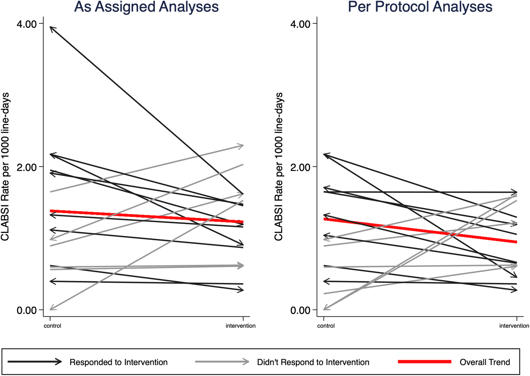
FIGURE 2:

Crude incidence of central line associated bloodstream infections (CLABSI). Each line represents one clinic. The slope shows the change in incidence of CLABSI between the intervention and control periods. The red line represents the change in overall crude incidence during intervention and control periods. Black lines represent clinics that had a decrease in CLABSI during the intervention period and blue lines represent clinics that did not have a decrease in CLABSI during intervention periods. Arrows indicate the assignment change from period one to period two, such that an arrow pointing to the intervention side indicates that the unit was assigned to control in period 1 and crossed over to intervention in period 2.
