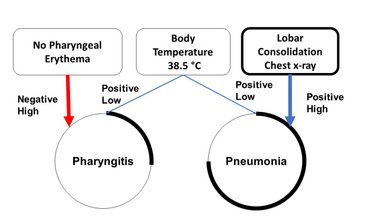
Figure 4.

Schematic overview of the pattern analysis process. Should the diagnostic factor increase the probability of the chosen diagnostic hypothesis, then the positive likelihood of such a relationship is represented by a connecting blue line. If a diagnostic factor is thought to decrease the likelihood of the diagnostic hypothesis, then the connecting line is depicted in red. When the diagnostic factor does not affect the diagnostic hypothesis, no connecting line is drawn. In addition, the student is asked to weigh the relevance of the diagnostic factors in relation to the hypothesized diagnoses. This is automatically translated into a graphic representation with an increase (positive) or decrease (negative) of the thickness of the connecting lines. In the example in the image, the presence of lobar consolidations on the chest x-ray was highly suggestive of pneumonia (positive high). Therefore, the thickness of the connecting line becomes wider. The circumference of the diagnostic hypothesis node was related to the probability that the chosen diagnosis was correct. As the probability of diagnosis increased, the portion of the highlighted circumference increased as well.
