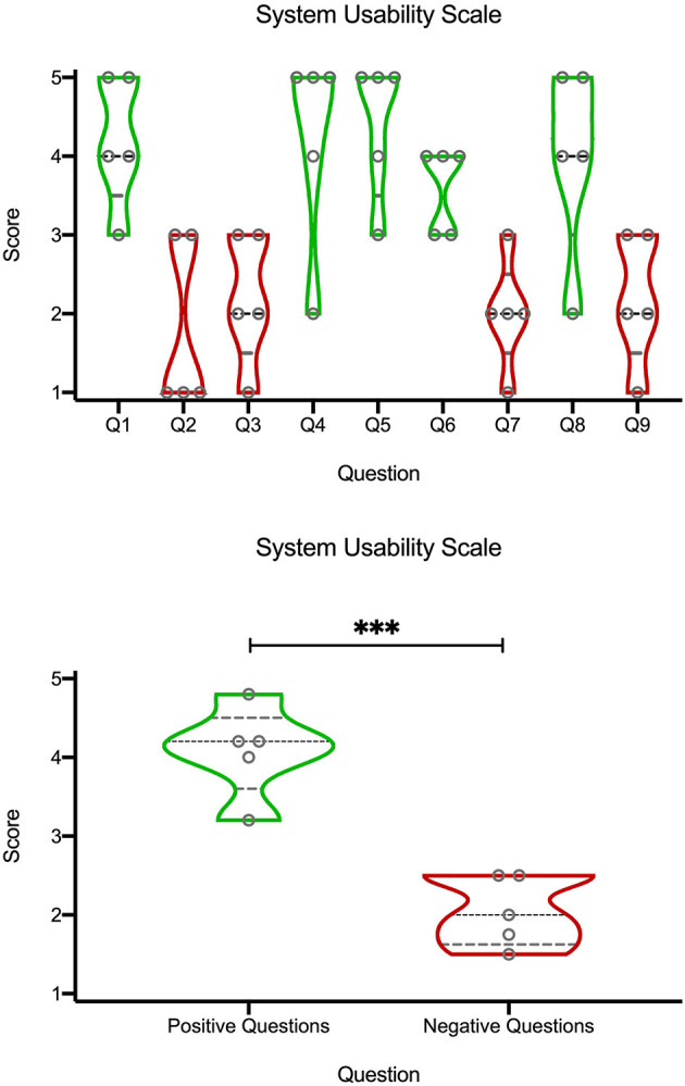
Figure 4.

Violin plots of quantification of the SUS questionnaire (Table 1) on a Likert scale (1 corresponding to “strongly disagree,” and 5 to “strongly agree”). Black dashed line represents the median, the gray dashed lines represents the quartiles, and width of the violin corresponds to the number of points at a certain height. The top graph are the scores from individual questions. Bottom graph is an average from “positive” (green) or “negative” (red) questions. ***p < 0.01, unpaired t-test.
