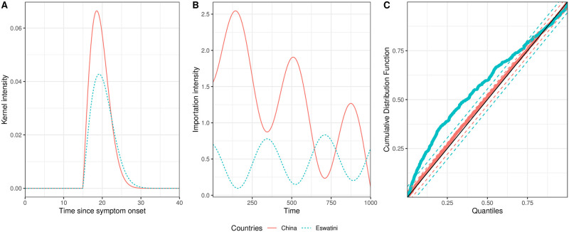
Fig 4. Fitted endogenous and exogenous terms for the China and Eswatini data.
Fig 4A shows the fitted kernel intensity for a single infection, which corresponds Eq (5). Fig 4B shows how the exogenous terms vary through time. Fig 4C shows results from the Kolmogorov–Smirnov goodness of fit tests. The solid red lines and dots correspond to the China data and the dashed blue lines and dots correspond to the Eswatini data. The black solid line in Fig 4C is the line y = x and the red and blue dashed lines are the 95% confidence intervals for the China and Eswatini data set respectively.

