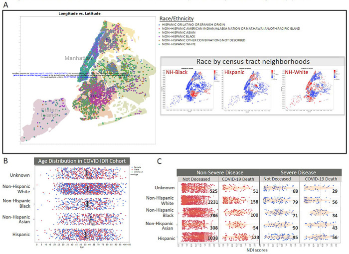
Figure 1. Residential area, NDI and race distribution of NYP COVID patients are representative of general population.

(A) Geographic distribution of COVD-19 patients by latitude-longitude coordinates, color-coded by self-reported race/ethnicity groups. Inset indicates the prevalence of specific race groups across the patient’s neighborhoods, based on census-track data. (B) Age distribution of cohort, by race. Bars indicate the mean age for each race group. Color coding of points indicate self-reported sex (Blue=Female, Red=Male). (C) Distribution of Neighborhood Deprivation Index (NDI) scores, by race. Column groups are based on our severe disease status model and mortality outcome models
