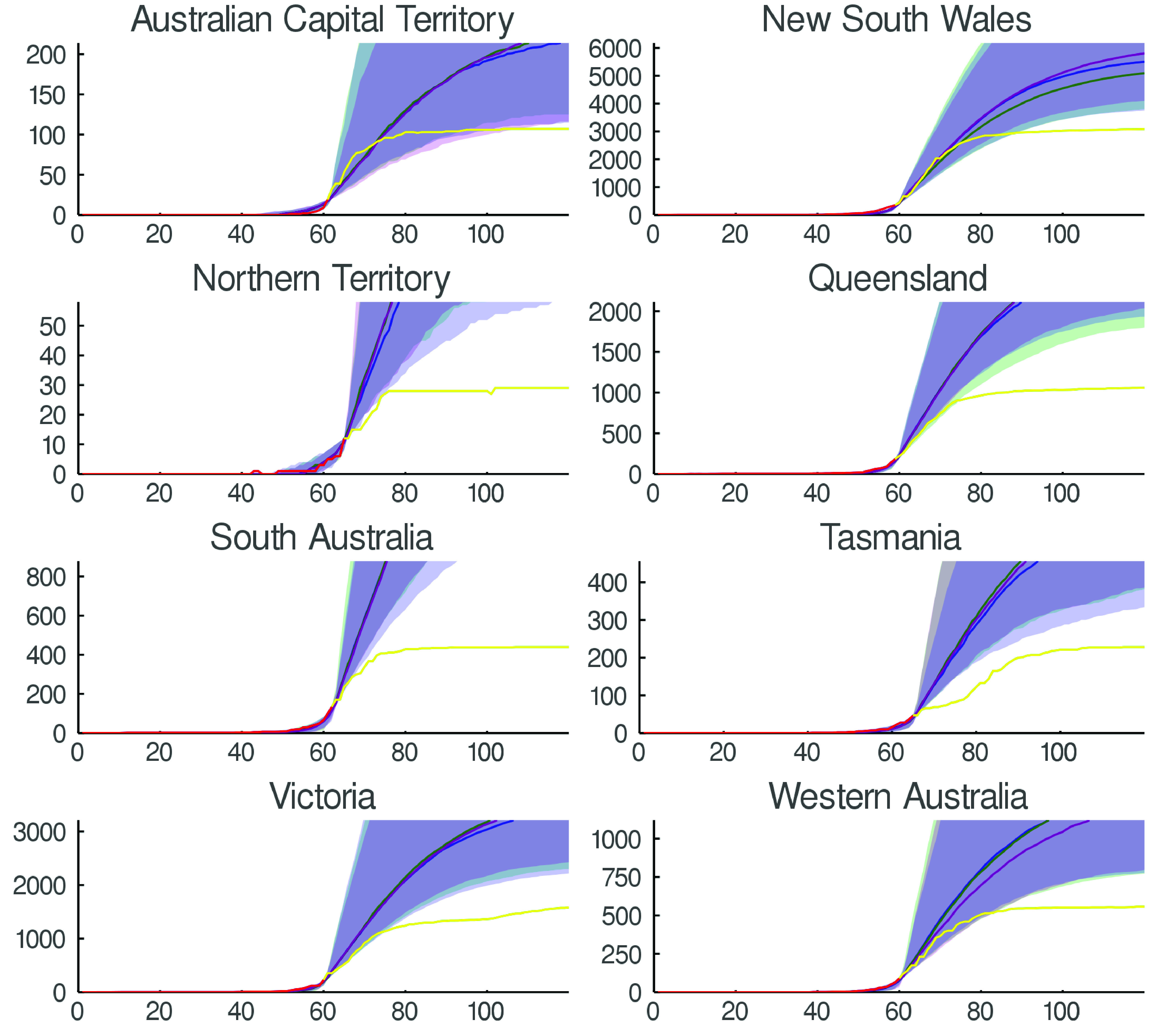
FIGURE 5.

Control evaluation. We depict the effectiveness of control measures for each Australian state and internal territory (excluding Jervis Bay). In each case the epidemic diffusion is fitted to data up to the end of the exponential growth phase (that is, the point of inflexion on curves  ). Simulations up to this time point
  effectively seed the network and provide a distribution of infectious and exposed individuals within the community. Beyond this point we simulate the application of small-world control network structure
  for various values of
  . Here we illustrate
  ,
,  and
and  corresponding to 95%, 90% and 80% control. Actual observed time series data is also shown and illustrates exception effectiveness of control measures for various Australian states.
