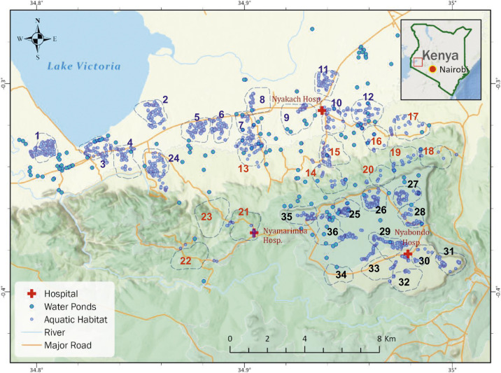
Figure 6.
Distribution of villages and clusters based on reclassification result. Numbers in different colors indicated different risk groups. Each number represented a cluster as shown in Figure 5. The dash line illustrated the 500-m buffer boundary for each cluster. Blue dots and light blue circles, respectively, represent aquatic habitats and large water ponds found from on satellite images. This figure appears in color at www.ajtmh.org.

