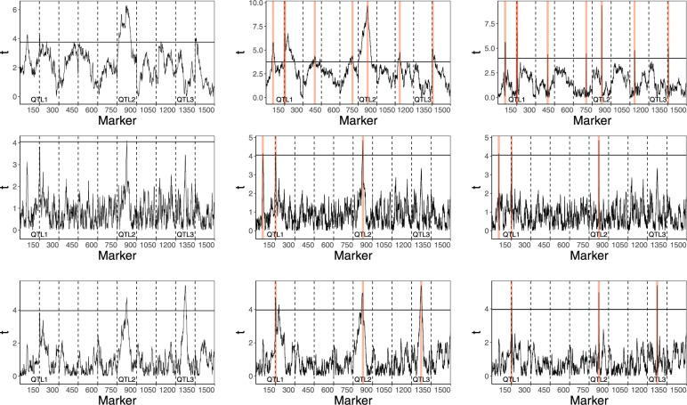
Figure 4.
Results of QTL mapping for a trait simulated according to model (15) with n = 200. The upper, middle and lower panels show the results of the analysis with the classical fixed effect model, the mixed model with μ = 0 and the mixed model (3), respectively. In each of these panels, the graph on the left represents the results of the single marker tests, while the remaining panels present the results of the respective stepwise selection procedures. The red vertical lines mark the positions of markers selected by these procedures. The middle graphs show the plots of t-statistics when conditioning on QTL identified on other chromosomes. The right graphs show the plots of t-test statistics conditioned on all identified QTL.

