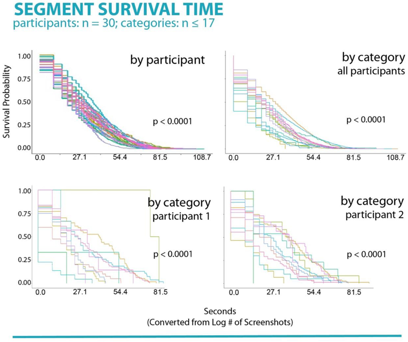
Figure 2.

Top left panel. Survival analysis for each participant in the study. Each curve represents an individual’s likelihood of switching screens at a given point in time. Individual differences in survival rates (i.e., rate of switching behaviors) were found. Top right panel. Survival analysis for each of 17 screen segment categories in the study, aggregated across the sample. Each curve represents the sample’s likelihood of switching screens given a particular screen category at each time point. Differences in survival rates (i.e., rate of switching behaviors) were found. Bottom panels. Survival analysis for each of 17 screen segment categories in the study for two individuals. Individual differences between switching behaviors given a certain screen category can be seen.
