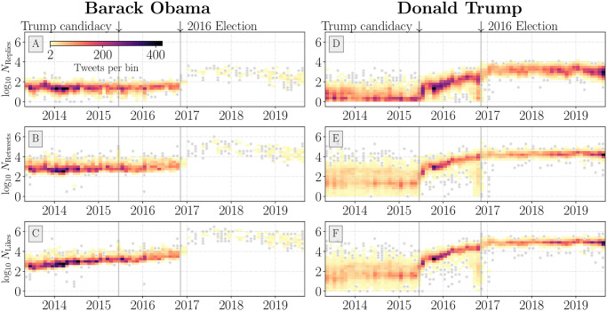
Fig 2. Time series histogram of maximum activity counts for tweets posted from the Barack Obama (A–C) and Donald Trump (D–F) Twitter accounts.
Each bin represents a collection of tweets at their original author date along with their respective maximum observed activity count. Bins with less than 2 tweets are shown as grey dots. We include all tweet types (e.g., advertisements, promoted, etc.); see Section 2.1 for information on collection methods. We annotate Trump’s declaration of candidacy and the 2016 US general election with solid vertical grey bars. A marked decrease in Obama account activity is apparent immediately following the 2016 election. The region of outliers in the Trump time series immediately preceding the 2016 election has been determined to be largely reflective of promoted tweets which have abnormal circulation dynamics on the platform [69].

