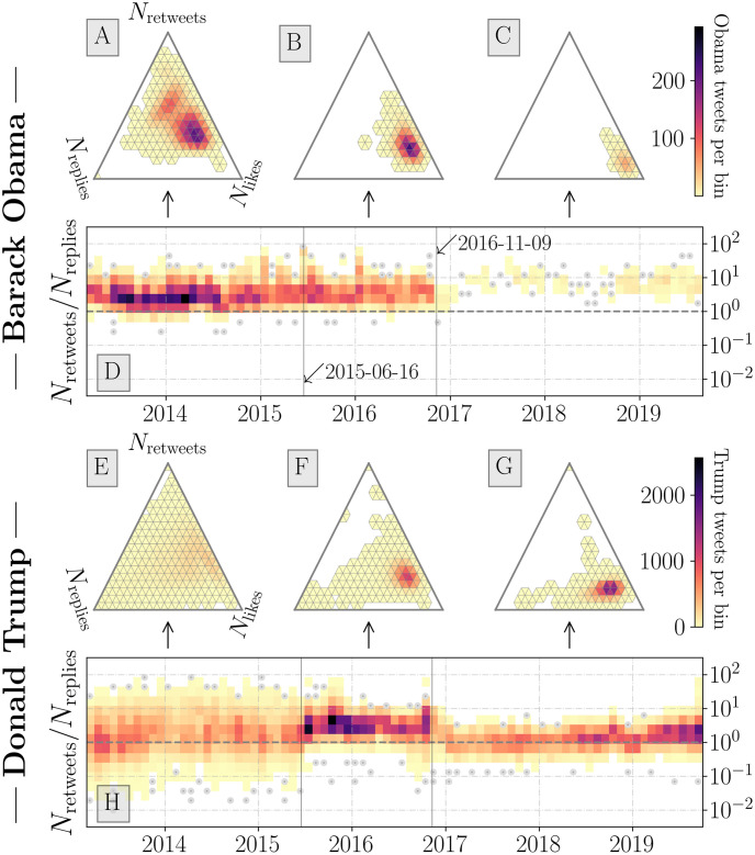
Fig 3.
Ternary histograms and Nretweets/Nreplies ratio time seriesfor the @BarackObama (A–D) and @realDonaldTrump (E–H) Twitter accounts. The ternary histograms (A–C and E–H) represent the count of retweet, favorite, and reply activities normalized by the sum of all activities. White regions indicate no observations over the given time period. See Fig 4 for examples of full time series for response activity for example tweets. Heatmap time series (D and H) consist of monthly bins representing the density of tweets with a given ratio value. Single observations (bin counts <2) are represented by grey points. The two dates annotated correspond to the date of Trump’s declaration of candidacy (2015–05–16) and the 2016 general election (2016–11–09). We show the tendency for Trump tweets to have ternary ratio values with a greater reply component—with pre-candidacy tweets having higher variability and pre-election tweets having a higher Nretweets/Nreplies ratio value. Post-election Obama tweets have ternary ratio values with more likes than other periods for both Obama and Trump.

