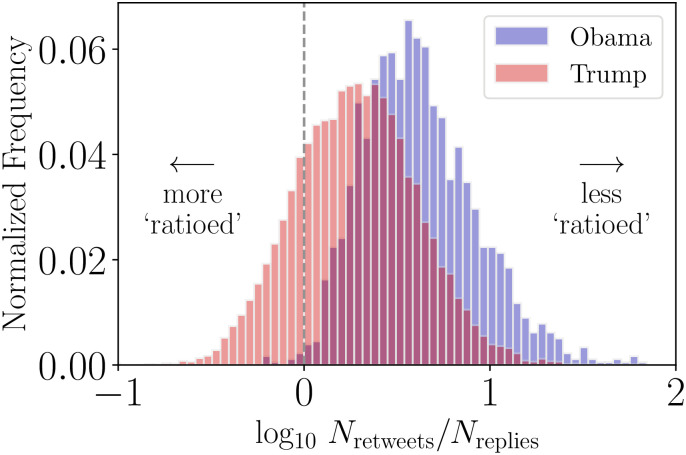
Fig 5. Histogram of final observed ratios for tweets authored by @BarackObama and @realDonaldTrump accounts.
Observations left of the dashed vertical line correspond to tweets that are considered ratioed. The shift in the distribution corresponding to Trump’s account can be plainly seen—with the account producing more tweets that are ratioed than compared with Obama’s account. For both accounts, tweets shown here are restricted to those authored after Trump’s declaration of candidacy. Of 16,708 tweets included from the Trump account, 3,015 (18%) have a Nretweets/Nreplies value less than or equal to 0 and 13,693 (82%) have a score greater than 0. Of 1,786 tweets from the Obama account, 7 (<1% have Nretweets/Nreplies values ≤ 0 while 1,779 (>99%) have values >0. From the distribution of ratio values we see that ratioed tweets are outliers for the Obama account while the Trump account often gets ratioed and has a lower ratio value on average.

