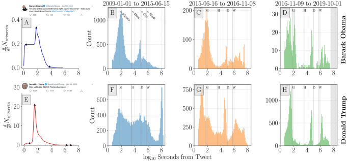
Fig 6. Distribution of inflection points, the local maxima of instantaneous retweet volume, , where .
A and E: Example cumulative retweet time series and inflection points (solid triangles) for Obama and Trump tweets. Histograms show the distribution of inflection points across all tweets binned by time periods before (B and F), during (C and G), and after (D and H) the 2016 US presidential election campaign. The January 1st 2009 to June 15th 2015 period for Trump (F) contains inflection point counts that are largely reflective of low initial activity and high(er) late activity (months or years later) leading to unusually high values for seconds to first inflection point (>108 seconds). For Obama’s and Trump’s time in office, tweets experience inflection points around 1-minute and 1-day after the tweet is authored—indicating characteristic time-scales of activity waning. Histogram bin widths are in effect logarithmically spaced over the displayed time span. This has the effect of providing a higher temporal resolution for shorter timer periods. Direct links for Obama tweet (A): https://twitter.com/BarackObama/status/693571153336496128 and Trump tweet (E): https://twitter.com/realDonaldTrump/status/1090729920760893441. Screenshots were collected on May 28, 2020.

