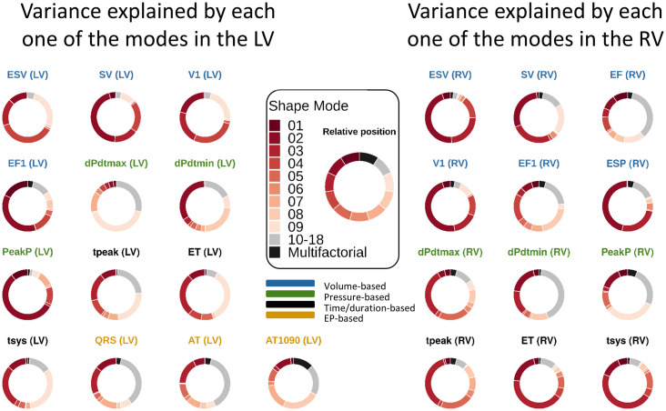
Fig 9. GSA performed using GPEs.
A different GP has been used for each one of the phenotype. The bigger the slice in the doughnut chart, the more variance is explained globally by that mode as a first order effect. Interrelations between modes are encompassed in the multifactorial effects. The relative position between modes is consistent across the charts, as indicated in the legend in the centre. The titles of the doughnut charts are colour-coded according to the group of phenotypes they belong to.

