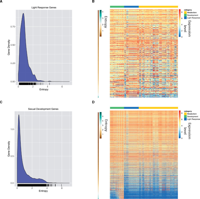
Figure 3.
Validating entropy values with previously published light-induced genes and genes induced during sexual development. (A) The relative frequency of entropy values for a list of light-induced genes is shown as a KDE plot. The rug plot, black lines on the bottom in the KDE plot, represents the individual data points that create the estimation. The y-axis is the probability density, which is the probability for each unit (gene) on the x-axis. The total area below the KDE curve integrates to one. (B) The heatmap shows the expression value for light-induced genes across all conditions analyzed. The expression level for each gene is plotted as the log2 transformed TPM value. Genes (rows) are plotted in ranked order based on the entropy value from low (top) to high (bottom). The scale on the left indicates entropy values for each gene. Each condition (column) has been assigned a category: Metabolism (gold), Development (green), or Light Response (blue). The categories are represented at the top of the heatmap in the three different colors. (C) The relative frequency of entropy values for a list of sexual development genes is shown as a KDE plot. The rug plot, black lines on the bottom in the KDE plot, represents the individual data points that create the estimation. The y-axis is the probability density, which is the probability for each unit (gene) on the x-axis. The total area below the KDE curve integrates to one. (D) The heatmap shows the expression value for sexual development genes across all conditions analyzed. The expression level for each gene is plotted as the log2 transformed TPM value. Genes (rows) are plotted in ranked order based on the entropy value from low (top) to high (bottom). The scale on the left indicates entropy values for each gene. Each condition (column) has been assigned a category: Metabolism (gold), Development (green), or Light Response (blue). The categories are represented at the top of the heatmap in the three different colors.

