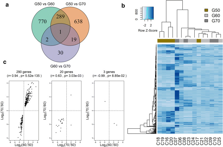
Fig. 1.
The Venn diagram of differentially expressed genes (DEGs) in each group comparison (a). Heatmap of 311 DEGs presented in at least two comparisons, rows represent genes and columns each sample. Bars are colored according to each group G50 (gold), G60 (light gray), and G70 (dark gray). Gene expressions are scaled by blue colors, and light blue indicates lower expression and dark blue higher expression (b). Plot of log2 (ratio expression) of overlapping gene between the comparison analysis (c)

