FIGURE 6.

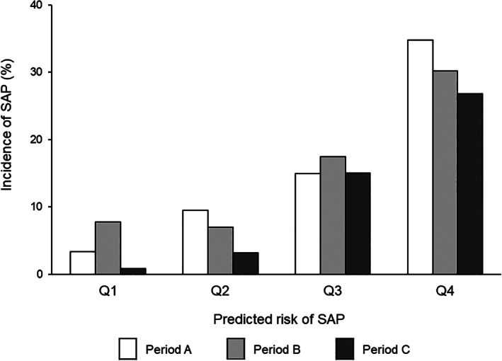
Incidence of stroke‐associated pneumonia (SAP). Diagram showing incidence of SAP with respect to predicted risk of SAP in periods A‐C. Predicted risk of SAP was estimated from baseline data and stratified into quartiles (Q1‐Q4)

Incidence of stroke‐associated pneumonia (SAP). Diagram showing incidence of SAP with respect to predicted risk of SAP in periods A‐C. Predicted risk of SAP was estimated from baseline data and stratified into quartiles (Q1‐Q4)