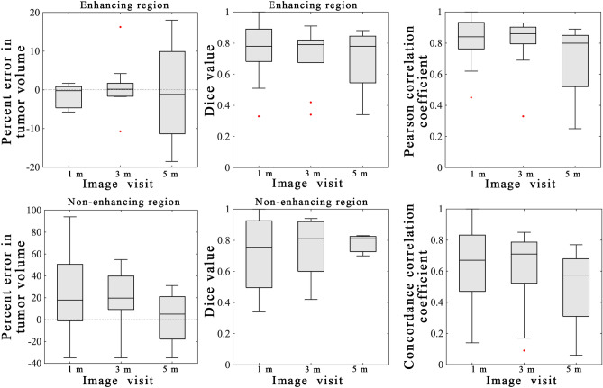
Figure 4.
Summary statistics from scenario 1. Error analysis from the model calibration scenario are shown for the entire cohort using the best model. The left column shows the percent error in the tumor volume for the enhancing (top) and non-enhancing (bottom) regions. Greater error was observed in the non-enhancing regions versus the enhancing regions. The middle column shows the Dice values for the enhancing (top) and non-enhancing (bottom) regions. A high level of overlap (median Dice values all greater than 0.76) were observed for the enhancing regions and the non-enhancing regions. The third column shows the results of the voxel-level error analysis for the PCC (top) and CCC (bottom). A high level of agreement and correlation was observed at earlier time points (1-month) versus at later time points (5-month). MATLAB R2019b (Mathworks, Natick, MA) was used for producing individual figures, images, and graphs. Adobe Photoshop 2020 (Adobe, San Jose, CA) was used to arrange individual panels, draw schematics, and add text.

