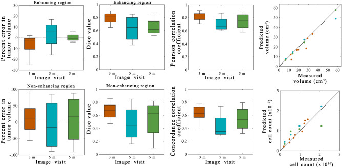
Figure 6.
Summary statistics from scenarios 2 and 3. Error analysis from the model prediction scenarios are shown for the entire cohort. The orange bars and points represent 3-month predictions made from calibrations using the 1-month visit for calibration (scenario 2). The blue bars and points represent 5-month predictions made from calibrations using the 1-month visit for calibration (scenario 2). The green bars and points represent 5-month predictions made from calibrations using the 1-month and 3-month visits for calibration (scenario 3). The left column shows the percent error in the tumor volume for the enhancing (top) and non-enhancing (bottom) regions. Greater error was observed in the non-enhancing regions versus the enhancing regions. The second column shows the Dice values for the enhancing (top) and non-enhancing (bottom) regions. A high level of overlap (median Dice values greater than 0.62) were observed for the enhancing regions while the non-enhancing regions had greater error (Dice greater than 0.45). The third column shows the results of the voxel-level error analysis for the PCC (top) and CCC (bottom). The fourth column shows the predicted versus measured tumor volume (top) and cell count (bottom) within the enhancing region. For the 3-month predictions (orange dots) KCCs for tumor volume and cell count predictions were 0.94 and 0.92, respectively. For the 5-month predictions (blue dots) the KCCs for tumor volume and cell count predictions were 1.00 and 0.88, respectively. For the 5-month predictions (blue dots) the KCCs for tumor volume and cell count predictions were 1.00 and 0.79, respectively. MATLAB R2019b (Mathworks, Natick, MA) was used for producing individual figures, images, and graphs. Adobe Photoshop 2020 (Adobe, San Jose, CA) was used to arrange individual panels, draw schematics, and add text.

