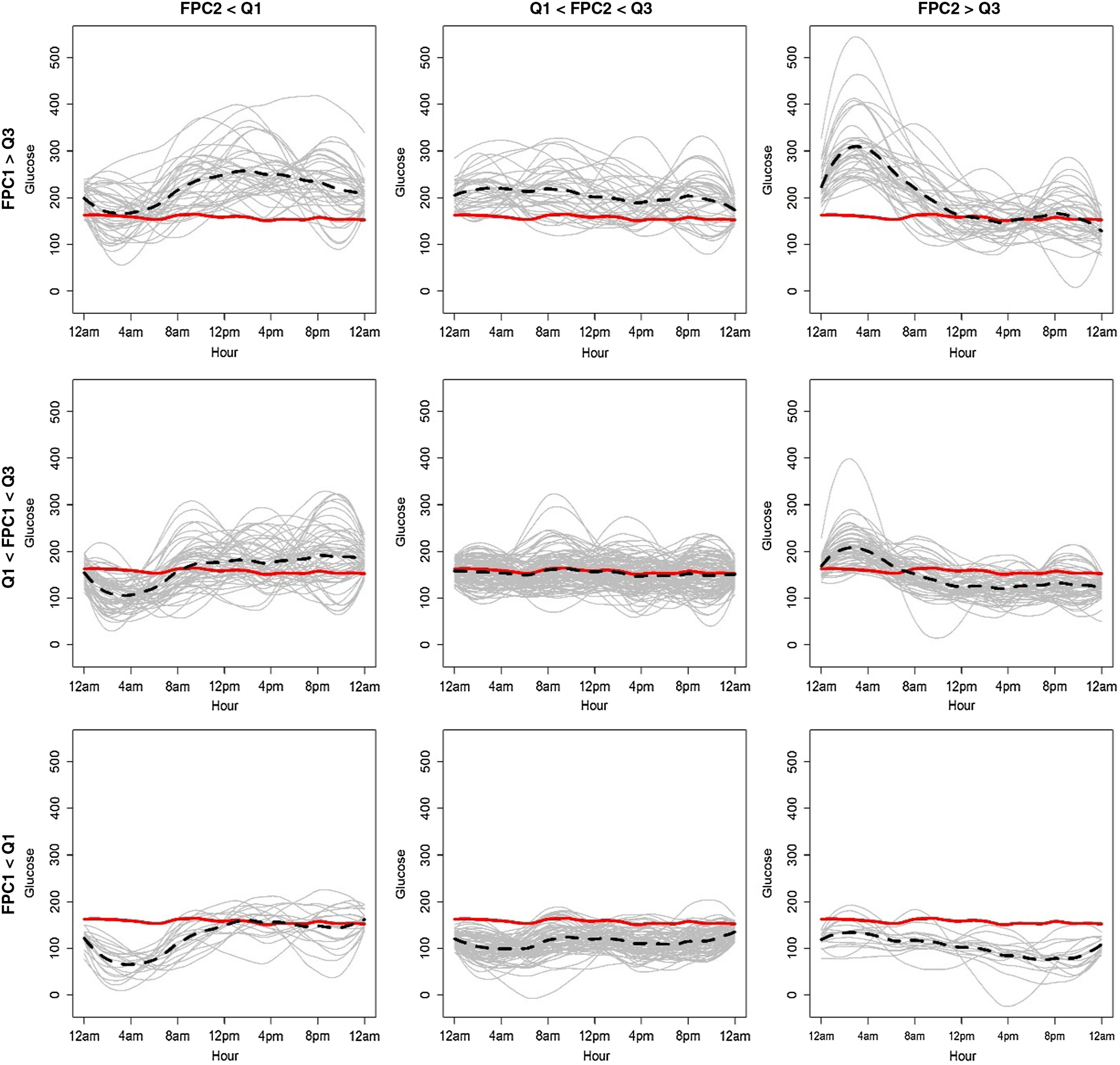
Fig. 2.

Phenotypes (clusters) of patients according to glycemic variability over time. Smoothed CGM sensor tracings (gray lines) categorized by quartiles (Q1, Q3) and medians of each of the first two FPCs (FPC1, FPC2) scores in the functional principal components analysis for sparse longitudinal data (FPCA). The solid red line is the mean function of glucose (y-axis) over clock time (x-axis); the dashed black line is the mean function for the specific groups.
