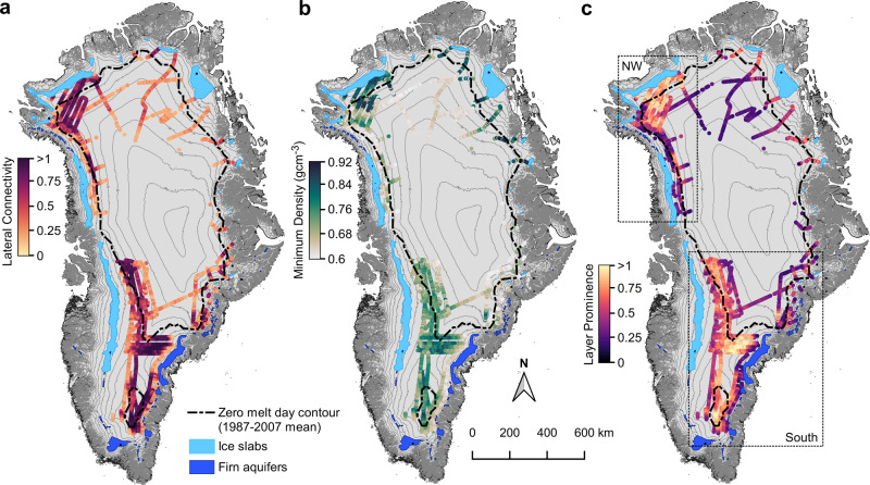
Fig. 2. Radar-derived characterization of the 2012 melt layer.
a Horizontal connectivity of the 2012 melt layer, shown by color shading along flight transects. A score of 1 or greater indicates a perfectly connected layer, with dark colors indicating high connectivity. b Minimum layer density consistent with observed radar reflectivities, shown in color shading along flight transects. Dark green dots indicate high-density regions. c Radar-inferred layer prominence, shown in color shading along flight transects. Light yellow regions indicate high layer prominence. Dark blue polygons show firn aquifer extent42, light blue polygons the ice slab extent9, and the dashed black line the 1987–2007 average zero melt day contour derived from passive microwave data64. Surface elevation contours (200 m interval) are shown in gray. The dashed black boxes in c show the regions referred to as northwest and southern Greenland in the climatological analysis and Fig. 3.

