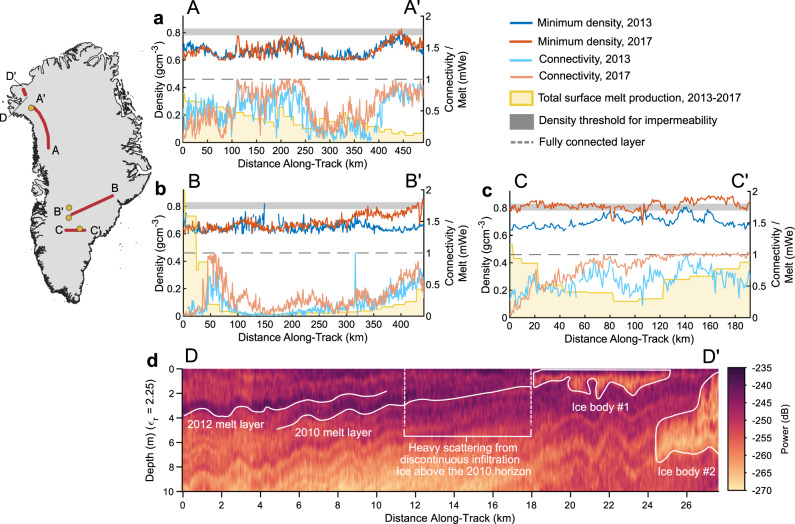
Fig. 4. Temporal evolution of the 2012 melt layer between 2013 and 2017 along three representative flight transects where repeat flights are available.
In these panels, dark blue curves show the radar-inferred minimum layer density in 2013 and dark red curves show minimum layer density in 2017. The range of densities at which firn becomes impermeable is shown in the dark gray shading. Light blue curves show lateral layer connectivity in 2013 and light red curves show the same in 2017. The lateral connectivity score of a fully connected layer is shown in the dashed gray line. Yellow curves show the MAR-modeled total surface-melt production from April 2013 to April 2017 in meters of water equivalent. Yellow dots on the inset map show the location of firn temperature profiles from Camp Century, the NASA-SE GCNet site, and the 2016 GreenTRACS traverse and red lines show the locations of the flight transects shown in the panels. a Melt layer evolution in northwest Greenland. b Melt layer evolution from southeast to southwest Greenland. c Melt layer evolution in south-central Greenland. d Radargram showing the down-glacier convergence of the 2012 melt layer into a near-surface ice slab8,9. Image colors represent received radar power, with darker colors showing stronger returns consistent with high density contrasts in the firn.

