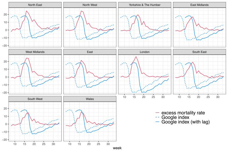
Figure A.2.
Time series of excess mortality rate per 100,000 individuals (red lines) and change in Google mobility index in week t (dashed blue lines) and with a five-week forward shift (solid blue lines) in England and Wales by region during weeks 8–33 of 2020. The Google index was multiplied by 10 for illustration purposes. Source: Authors' own elaboration based on data from Office for National Statistics (2021, 2020a) and Google LLC (2021).

