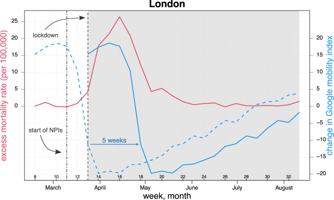
Fig. 2.
Time series of excess mortality rate per 100,000 individuals (red line) and change in Google mobility index at week t (dashed blue line) and with a five-week forward shift (solid blue line) in the region of London during weeks 8–33 of 2020. Solid lines in the grey shaded area correspond to values analysed as described in the “Statistical analysis” section. Vertical lines indicate the start of NPIs on March 12 (week 11) and the lockdown ordered on March 24 (week 13), respectively. The Google index was multiplied by 10 for illustration purposes. Source: Authors' own elaboration based on data from Office for National Statistics (2021, 2020a) and Google LLC (2021). (For interpretation of the references to colour in this figure legend, the reader is referred to the Web version of this article.)

