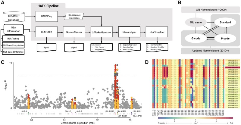
Fig. 1.
(A) Overall diagram of the HATK pipeline. (B) Nomenclature conversions provided by NomenCleaner. (C) MHC Manhattan plot and (D) MHC heatmap plot examples. The shading under an amino acid residue shows the amino acid association, whereas the shading under an allele shows the allele association. Both plots were generated using rheumatoid arthritis case/control data from the Wellcome Trust Case Control Consortium (Burton et al., 2007). Red: amino acid, yellow: HLA allele, dark gray: intragenic SNP markers, light gray: intergenic SNP markers in the Manhattan plot

