
Fig. 3. Frequency and spatial mapping of single-cell clusters from tissue.
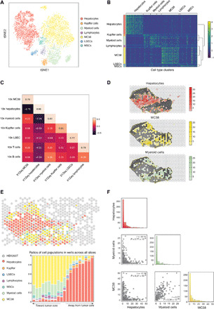
(A) tSNE visualization of the cell types identified from liver/tumor tissue. A total of 6623 total cells were plotted. (B) Heatmap of scaled marker gene expression and hierarchical clustering of genes that define each cell type from liver/tumor tissue. Reference for color bar in (A). (C) Correlations of pseudobulk expression values for matching cell types between XYZeq and 10x Genomics Chromium. (D) Spatial localization of hepatocytes, MC38, and myeloid cells overlaid on a bright-field image of tissue. Yellow dotted outline indicates tumor regions. (E) Pie chart of cell type composition for each XYZeq well from a representative liver/tumor tissue slice (top) and bar chart illustrating combined cell type composition across all four slices of liver/tumor tissue, which tracks with proximity to the tumor (bottom) (see Methods for proximity score). (F) Pairplot showing the frequency of hepatocytes, MC38, and myeloid cells in each well. Scatterplots show the colocalization of two cell types in each well. Histograms show the distribution of number of cells (x axis) per well (y axis) for each cell type. Pearson correlation (r) and P values are annotated.